SHEIN
Nov - Dec 2023
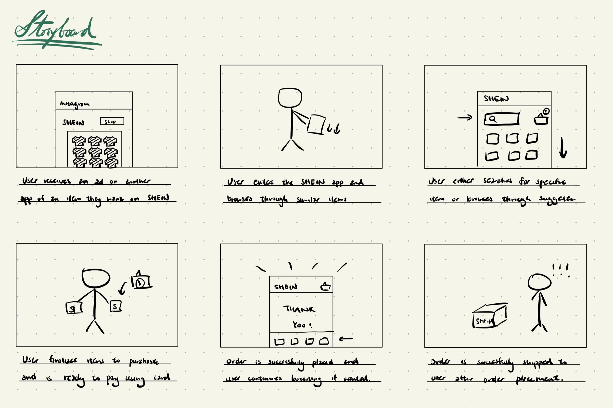
Enhancing SHEIN’s mobile user experience by streamlining the current user flow. Optimising the platform’s navigation through simplifying the shopping process and checkout process.
Tool Used: Figma
Completed as a personal practice project through Web Development @ Berkeley
The Problem
As an e-commerce platform with over 65 million app users, SHEIN’s item discovery and checkout process is not the smoothest for users. This is because SHEIN offers many types of products as a fashion retailer, which often causes the in-app shopping experience to be overwhelming.
Through my project, here are some main pain points I want to address:
1. SHEIN’s header / item selection categories are very crowded, with limited information on what each category entails
2. There are many in-app pop ups and advertisements that can be distracting and overwhelming in the landing page
3. There are many directions and ways users can interact with the app’s content, which can be confusing
4. The size of call-to-action buttons can be very small, which can cause the user to misclick easily
The User Research Process
-
The People
To better understand the behaviours of different SHEIN app users, I conducted user research across various demographics within the UC Berkeley student population, including:
1. Students who have downloaded the app for more than 2 years
2. Students that regularly shop from SHEIN (more than twice a month)
3. Students that sometimes shop from SHEIN (once every month)
4. Students that never shop from SHEIN, and don’t have the app downloaded
-
User Interview
To understanding the opinions of SHEIN users and their purpose of using the app, here are example questions used during the interview:
1. Do you use SHEIN to discover new products, or do you use it purchase specific items you have in mind already?
2. How easy is it to find the product you want to find on SHEIN?
3. How often do you use the side bars or categories in the headings to find the product you want? Is this more useful, or is the search bar more useful in doing so?
4. Are you interested in the the suggested items on the landing page / browsing page / thank you page?
-
Contextual Inquiry
To learn how different users interact and make use of the app, I also asked them to perform the following tasks using the SHEIN app after the interview:
1. Search for a specific type of product given to them on Shein, with specific requirements, such as colour, size, style, etc
2. Search for information regarding their order / arrival date
3. Find information / contact help if a part of their package is missing
Research Findings and Ideation Process
Key insights from user research:
- Participants across demographic groups are split between using SHEIN to discovery news products and buying a specific item in mind
- Almost all participants use the search bar to look for products in mind
- Users rarely use header categories to browse for new products they want, and often prefer scrolling on the landing page to do so
- New users / people that rarely use SHEIN struggled to look for specific products, and found finding specific information (e.g. order numbers and arrival dates) difficult
For this project, I focused on addressing ideas that are important and easier to implement, prioritising:
1. Decluttering the landing page
2. Providing easier access to specific products
3. Adopting a minimalist aesthetic
The 2x2 matrix above are all development ideas according to user input, categorized by importance and level of difficulty.
The Results
Here is the final prototyped result. The key features I incorporated going from low to high fidelity includes:
1. Keeping the main colour scheme as black and white to maintain simplicity
2. Using oft highlight colours to emphasise daily deals or other areas that should capture the users’ attention
3. Emphasizing the search bar on the landing page, since most users use this feature often
4. Reserving enough white space between products, reviews and ratings to maintain visual hierarchy.
Thank you for reading!


